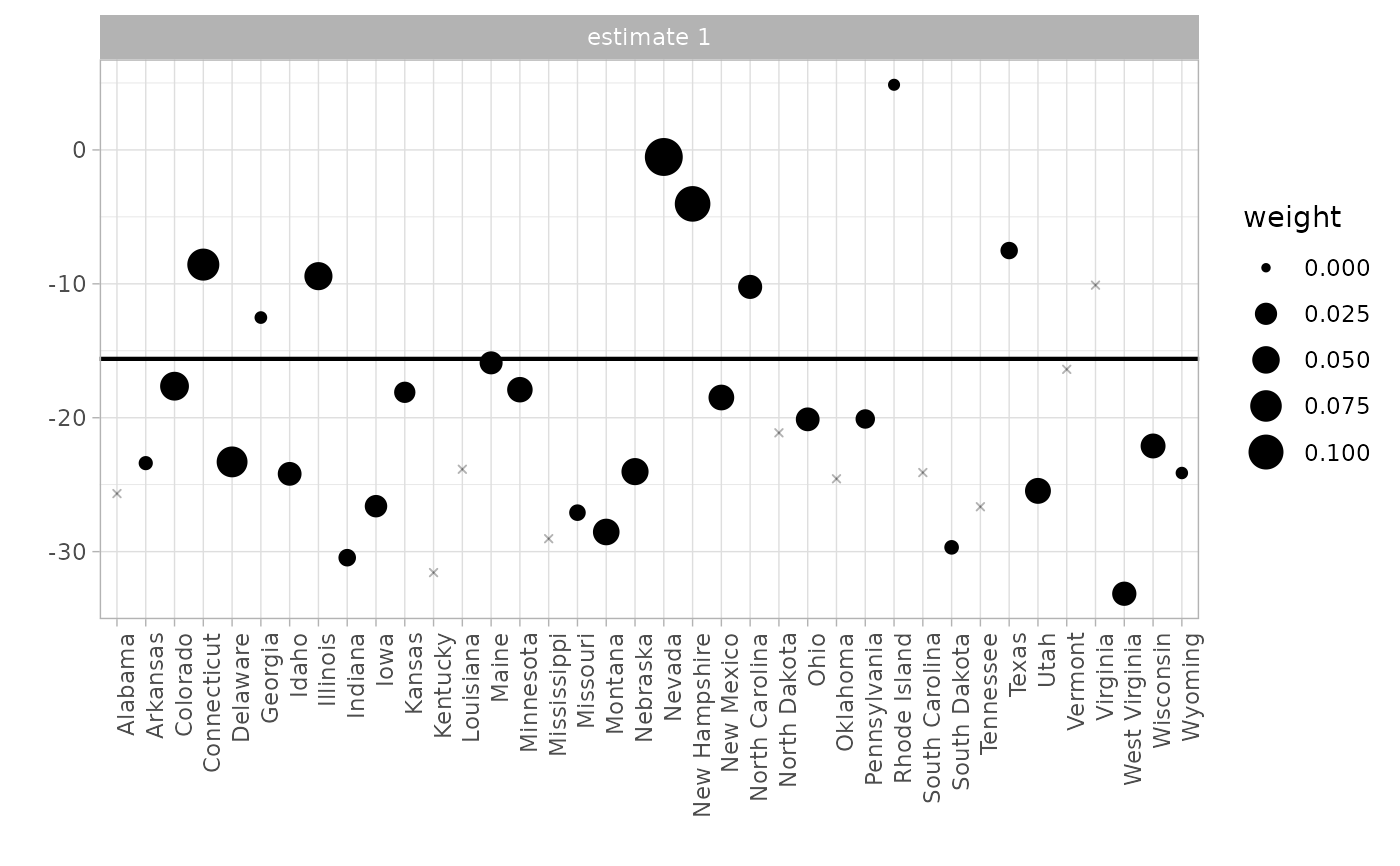
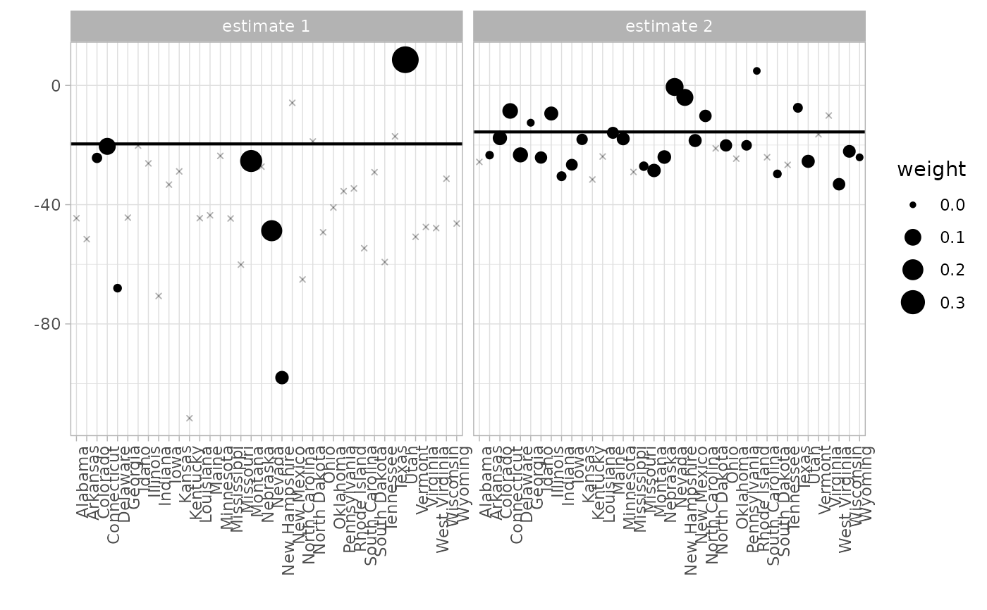
Plots unit by unit difference-in-differences. Dot size indicates the weights omega_i used in the average that yields our treatment effect estimate. This estimate and endpoints of a 95% CI are plotted as horizontal lines. Requires ggplot2
Source:R/plot.R
synthdid_units_plot.RdPlots unit by unit difference-in-differences. Dot size indicates the weights omega_i used in the average that yields our treatment effect estimate. This estimate and endpoints of a 95% CI are plotted as horizontal lines. Requires ggplot2
Usage
synthdid_units_plot(
  estimates,
  negligible.threshold = SYNTHDID_NEGLIGIBLE_WEIGHT_THRESHOLD,
  negligible.alpha = SYNTHDID_NEGLIGIBLE_ALPHA_DEFAULT,
  se.method = "jackknife",
  units = NULL
)
Arguments
- estimates
as output by synthdid_estimate. Can be a single one or a list of them.
- negligible.threshold
Unit weight threshold below which units are plotted as small, transparent xs instead of circles. Defaults to .001.
- negligible.alpha
Determines transparency of those xs.
- se.method
the method used to calculate standard errors for the CI. See vcov.synthdid_estimate. Defaults to 'jackknife' for speed. If 'none', don't plot a CI.
- units
a list of control units — elements of rownames(Y) — to plot differences for. Defaults to NULL, meaning all of them.
Examples
# \donttest{
data(california_prop99)
setup <- panel.matrices(california_prop99)
tau.hat <- synthdid_estimate(setup$Y, setup$N0, setup$T0)
# Plot all units
synthdid_units_plot(tau.hat)
 # Plot specific units only
# synthdid_units_plot(tau.hat, units = rownames(setup$Y)[1:10])
# Compare multiple estimates
tau.sc <- sc_estimate(setup$Y, setup$N0, setup$T0)
synthdid_units_plot(list(tau.sc, tau.hat))
# Plot specific units only
# synthdid_units_plot(tau.hat, units = rownames(setup$Y)[1:10])
# Compare multiple estimates
tau.sc <- sc_estimate(setup$Y, setup$N0, setup$T0)
synthdid_units_plot(list(tau.sc, tau.hat))
 # }
# }